Top 10 common ecommerce website mistakes to avoid in 2026

The ecommerce industry is rife with competition with multiple players vying for market share. Hence, fast-growing ecommerce businesses must continuously innovate to improve customer experience. They absolutely need to offer a seamless and painless shopping experience.
It's no secret that poor shopping experiences directly impact conversions and revenue. Therefore, ecommerce website mistakes that might be leading to sub-par customer experiences are detrimental to the business' top line.
A market research report involving testing of top ecommerce sites found more than 3000 bugs impacting UX and site performance. What’s more, the cost of 1 bug was almost $1 million in just 14 days.
In fact, 10 top US retailers lost more than $60 million in the holiday season because of 65 high-severity bugs. Yet, a majority of the ecommerce stores continue to operate with websites riddled with bugs, glitches, or simply other UI/UX mistakes that are easily avoidable.
This post will share common ecommerce website mistakes to avoid so you can deliver flawless customer experiences and boost your top-line revenue.
Ecommerce mistake #1: Disregarding registration/sign-in issues
The need for registration is a huge obstacle in the online purchasing process. In fact, a Databox survey reveals that ‘having to create a new user account’ is the #2 reason for shoppers abandoning their carts.
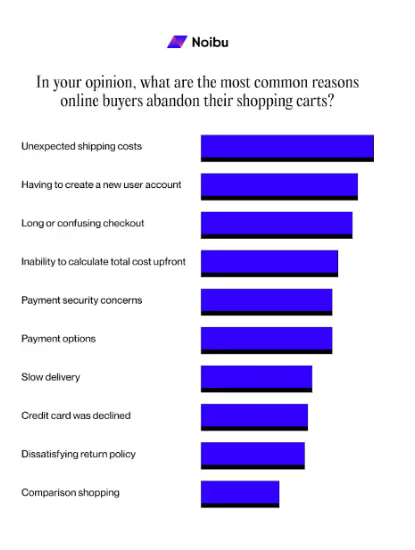
Shoppers dislike registration because they do not see value in it. They find the process time-consuming, unimportant, or inconvenient. The result - they end up leaving the website, never to return.
Issues with registration prevent the user from proceeding to purchase. That’s why it is among the top ecommerce mistakes online stores should avoid. Another common ecommerce website mistake online stores commit is creating a long and complex registration process. Doing so leads to friction and a poor user experience. Here are a few ways to improve the registration process:
Implement social sign-ins
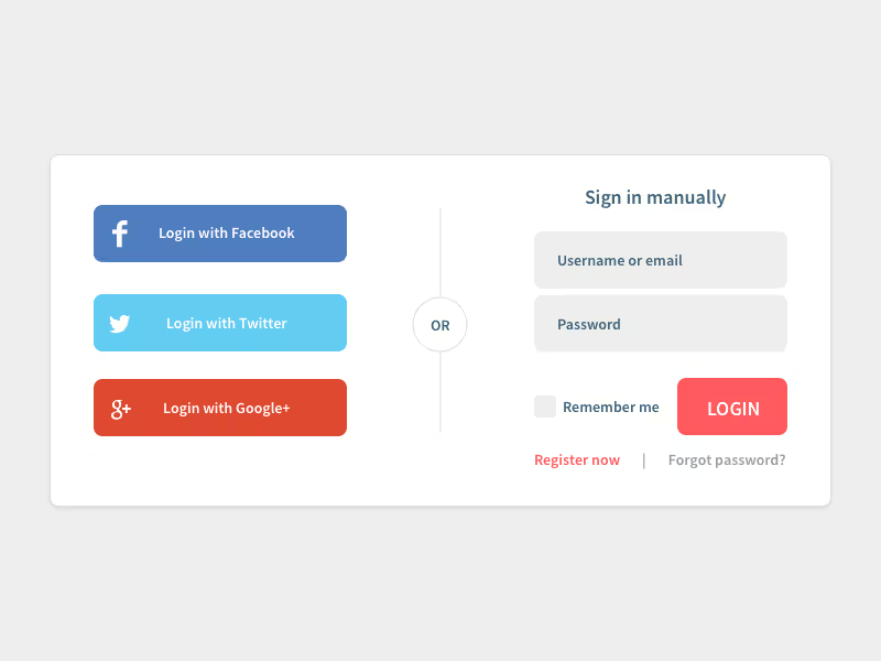
Social media sign-in options provide guest checkout options, allowing users to access your site with existing social media accounts, skipping the tedious registration process.
Here are a few key tips to consider when implementing social sign-ins.
- Choose well-known platforms like Facebook, Google, Twitter, and LinkedIn to appeal to a broad user base
- Communicate how you will use the social data to address privacy concerns that make users feel social sign-in more secure
- Social sign-in buttons should prominently yet unobtrusively appear to complement your website design and user flow
Implement guest checkout
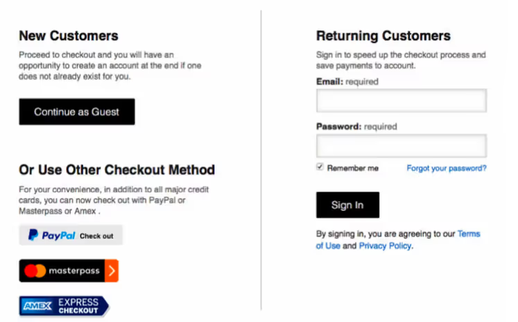
This enables first-time users to make purchases without creating an account and thus gives them the choice to share as much personal information/data with the brand as they want to.
Here are some key considerations:
- Keep the guest checkout option visible and accessible throughout the user journey until the checkout page
- Ensure capturing key user data while encouraging account creation post-purchase with incentives
- Streamline the guest checkout process by limiting the required information to only what's necessary for the transaction.
Progressive profiling to balance data collection with user convenience
Progressive profiling allows you to gradually collect users’ data from multiple interactions instead of requesting all information upfront.

This leads to improved user experience and increased likelihood of data submission. Here’s how you can implement progressive profiling.
- Start easy: Begin by asking for information (e.g., name, email) and progressively ask for more detailed data in subsequent interactions
- Leverage analytics: Use analytics to understand the best timing and context for requesting additional information. Use Google Analytics to monitor user behavior, engagement metrics, conversion pathways, and other ecommerce KPIs. Gather insights into how users interact within your site, highlighting areas of interest or confusion. A/B test different timings and contexts for requesting information to see what yields the highest user compliance and customer satisfaction.
- Personalize the experience: Use the collected data to personalize the customer experience on your site.
Ecommerce mistake #2: Not paying attention to broken site layout
Layout bugs cause issues at different levels of severity causing shoppers to drop off simply out of frustration. That’s why it is one of the worst ecommerce website mistakes impacting conversion rates and revenue.
Imagine having overlapping fields on your homepage or product description page. Or probably a drop-down list that doesn’t work. Such layout issues will not let your shopper complete their purchase. Hence, product and development teams must focus on website layout as any issues can hinder a seamless ecommerce checkout experience.
Here's how you can avoid these issues:
Rigorous cross-browser and cross-device testing
Testing is necessary to avoid committing common mistakes in ecommerce websites. This ensures your site performs seamlessly across all browsers and devices, preventing the audience from alienating due to technical glitches or layout issues.
- Leverage automation testing to provide comprehensive coverage and efficient issue identification.
- Develop a detailed testing checklist that covers major browsers and devices. To guarantee a uniform user experience, consider including different operating systems and screen resolutions.
- Invest in an ecommerce analytics & monitoring platform like Noibu that goes beyond traditional testing to proactively monitor your site in real-time, surface issues impacting experience and conversion, and provide the technical context your team needs to act fast.
Apply responsive website design principles to accommodate all users
A responsive design boosts the accessibility of your ecommerce site and usability, regardless of the device or screen size. Applying responsive design principles can help avoid the common ecommerce website mistake of broken layout. It offers an optimal viewing experience that adapts fluidly to the user's environment. Here’s what to do:
- Use fluid grid layouts that adjust smoothly across screen sizes. This approach uses percentages rather than fixed units, making it flexible and responsive.
- CSS techniques, like implementing flexible images and media, make your content responsive. This enables them to scale appropriately and maintain your website's layout integrity on different devices.
Use CI/CD tools for smoother updates and maintenance
Adopting Continuous Integration (CI) and Continuous Deployment (CD) practices can help you maintain the agility and reliability of your ecommerce platform. Implementing these practices can help prevent the most common ecommerce mistakes, enabling seamless integration of new code and update deployments. This will minimize disruptions and maintain a high level of site performance. Here are a few points to consider:
- Integrate CI/CD pipeline: Establish a CI/CD pipeline using platforms like Jenkins or GitHub Actions to automate the testing and deployment of code changes, ensuring smooth and continuous updates
- Automate testing within CI/CD: Embed automated testing to detect and resolve issues early in your CI/CD process. This helps maintain code quality and functionality with every update.
- After deployment, use monitoring tools to track the impact of updates on site performance. This will allow you to quickly identify and resolve issues introduced by new changes.
Ecommerce mistake #3: Neglecting issues with product filtering and sorting
The top online stores offer detailed filtering and sorting options by various parameters because they realize the importance of such features.
Check out how ecommerce businesses like Walmart and Amazon leverage filtering and sorting to enhance the shopping experience. This enables users to effortlessly navigate through your product catalog.
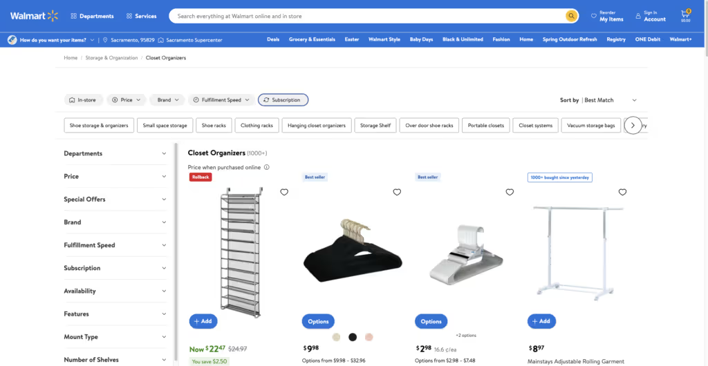
Unclear and poor product sorting and filtering frustrates shoppers as it comes in the way of product findability. Yet, one of the most overlooked ecommerce business mistakes is the lack of order and sorting in the product catalog. As an ecommerce business owner, you would ensure these features remain intuitive and robust to plummet bounce rates and boost the conversion rate. Here are a few best ecommerce practices we recommend.
Optimize user interface
A user-friendly interface for filtering and sorting options makes them easily accessible and understandable on your online store. It includes:
- Intuitive website design and placement: Use dropdown menus, checkboxes, or sliders to prominently and consistently display filtering and sorting options across product descriptions and listings.
- Clear labeling and groupings: Adopt clear, descriptive labels for all filtering and sorting options. Also, group related filters together (e.g., size, color, brand for clothing) that help users quickly understand their options. Note: Include a 'reset' or 'clear all' feature.
Leverage user data for personalization
Utilize analytics and user behavior data to tailor filtering options based on popular criteria or past user interactions.
Personalization elevates the shopping experience, making product discovery more relevant and efficient.
Here’s how to get started:
- Analyze user behavior using tools like Google Analytics to create custom events and apply and understand popular filters and sorting preferences. Other tools like MixPanel and Adobe Analytics can also identify patterns in customer behavior that help decide which options to prioritize or highlight on your site.
- Customize based on user history: Customize filter and sort options for registered users or those with a cookie history. For example, if a user consistently filters for vegan products, prioritize this filter for them in the future.
Improve backend performance
Optimize the technical implementation of filtering and sorting features for speed and accuracy. This requires indexing product attributes in your database and using efficient algorithms to handle queries, ensuring quick and precise results for users.
Here are a few tips to consider -
- Optimize database indexing based on the attributes used for filtering and sorting. This reduces the query load time to offer quicker results.
- Use optimized query algorithms using custom solutions or leverage database management system features to retrieve the data.
- Implement caching strategies to keep often-used data in memory. This reduces the need for constant database lookups for common filter and sort actions.
Ecommerce mistake #4: Ignoring a glitchy cart building experience
A seamless shopping cart experience is fundamental to conversions. At a stage that’s so close to the shopper making the payment, they should be able to effortlessly:
- Add/remove items to/from the cart
- Change the number of each item in the cart
- Have access to the exact pricing they need to pay during checkout
Yet, not prioritizing the shopping cart experience makes it to the list of common mistakes in ecommerce websites. This is a big cause of frustration for shoppers, causing them to leave and increasing your bounce rates. Issues like slow loading time, complex navigation paths, security issues, lack of payment options, and others can irk shoppers in the final stages of their purchasing journey. You wouldn’t want to lose revenue after getting the shopper so close to making a purchase decision. Here are a few tactics we recommend:
Streamlined checkout process
Simplify the checkout process by implementing features like auto-filling known customer information. For this, you can:
- Use browser cookies to remember user information
- Encourage users to create accounts for faster future checkouts
- Implement single sign-on (SSO) technology for ease of use.
Providing clear progress indicators so a customer or potential customer anticipates the pending process, which may otherwise lead to cart abandonment out of frustration. This requires:
- Implement a step-by-step progress bar or indicators at the top of the checkout page
- Use visual cues (like icons or numbers) to denote each step (e.g., " Shipping, " " Payment, " and " Confirmation).
- Make sure users can navigate to previous steps without losing the information they’ve added
Offering multiple payment options to accommodate user preferences. This includes:
- Traditional credit/debit cards
- Mobile payment systems like Apple Pay or Google Pay
- Popular online payment platforms like PayPal
- Buy Now Pay Later Options such as Affirm or Klarna
Robust error handling
Ecommerce sites often have multiple shopping categories and hundreds of product pages. Hence, it can be difficult to track errors. More often than not, bad ecommerce websites fail to handle errors effectively. Proper error handling involves figuring out how to resolve issues that lead to cart abandonment. Here’s how to approach it:
- Highlight the error field and provide immediate feedback on errors (e.g., an invalid card number). Also, explain how to fix it.
- Avoid using technical jargon in error messages. Here’s an example of both.
❌ Transaction Failure: Invalid payment gateway response. Check card data or utilize an alternate transaction facilitator.
✅ Your payment couldn’t be processed. Please check your card details or try a different payment method. - Implement backend logging to capture and analyze checkout errors to identify and address recurring issues.
Ecommerce mistake #5: Not resolving persistent checkout issues
Don’t make your ecommerce website a test of users’ patience. And surely not in the final sprint of the shopper journey—the checkout process.
Any friction during this process and you lose the sale, thus negatively impacting the conversion rate. And don't think they're saving it for later—chances are they'll never come back. Cart abandonment presently costs ecommerce brands a staggering $18 Billion in yearly sales revenue.
Yet, sadly, bad ecommerce sites fail to create a seamless checkout experience. Let’s explore some of the quick fixes for checkout issues.
One-click checkout
This option suits a returning or a potential customer, who can bypass the traditional checkout process using stored payment and shipping information.
Implementing one-click checkout requires a secure, easily retrievable, and up-to-date method of storing customer data. To safeguard this information, comply with data protection regulations.
Real-time validation
Use real-time validation for form inputs, which offers immediate feedback in case of incorrect or incomplete data. This prevents users from submitting the form only to encounter errors.
Use JavaScript or similar technologies on the front end to validate inputs dynamically. Also, check whether it negatively impacts the page's load time or customer experience.
Load time optimization
Optimize all checkout pages for faster loading times. This may require:
- Compressing images
- Leveraging browser caching
- Minimizing heavy scripts that could slow down the page
- Using content delivery networks (CDNs), etc.
Regular testing and monitoring
To ensure a flawless and uninterrupted checkout experience, it’s important to regularly scrutinize your website with ecommerce monitoring solutions. These solutions are designed to consistently scrutinize the site, spot issues, and alert developers on issues that may interfere with the checkout process.
Noibu is an ecommerce analytics & monitoring platform that proactively monitors your site in real-time, surfaces issues alongside their direct revenue impact, and provides the full technical context your team needs to prioritize and resolve them fast. Book a demo today.
Ecommerce mistake #6: Not resolving payment gateway issues
Security concerns have a dramatic effect on the purchase decision. Issues like design flaws, outdated layouts, missing images, and the absence of SSL certificates can dissuade shoppers from completing the purchase. Not having flexible payment options is also another reason why your target customers leave the site or the shopping cart. Further, several bugs pop up at this stage, ruining the payment process and damaging customer trust:
- Poor integration with payment options
- A long payment processing
- Charging customers an incorrect amount Issues with payment confirmation methods
- Unmapped or incorrect errors
- The absence of success/ confirmation message
Research shows that ecommerce merchants lose 62% of customers who’ve experienced a failed payment transaction. Hence, not resolving payment gateway issues is one of the worst ecommerce website mistakes an ecommerce can commit.
Implement encryption and tokenization
Encryption ensures that sensitive data, such as credit card numbers, is converted into a secure format only authorized parties can access.
Communicating tokenization in your checkout helps build trust by replacing sensitive data with unique identification symbols without compromising security.
Use 3D secure authentication
Add 3D security to add a layer of authentication during payment transactions. Customers must complete an extra verification step with the card issuer. Using this will reduce the likelihood of fraudulent transactions and chargebacks.
Employ comprehensive fraud detection tools
Advanced fraud detection and prevention tools use machine learning algorithms to analyze transaction patterns and flag potentially fraudulent activities. Tools like Kaunt, Signifyd, Sift, etc. help in real-time decision-making to approve or decline transactions based on risk assessment.
Ecommerce mistake #7: Failing to pay heed to poor integrations between functionalities
Imagine the havoc a problematic synchronization between your store and warehouse records can create.
Most of your items will show ‘out of stock,’ being unavailable for shoppers. This not only builds up frustration among customers but also amounts to lost revenue. Integration bugs disrupt user experience and backend operations.
Here are the issues they can cause -
- Incorrect inventory counts
- Failed transactions
- Data inconsistency
- Tracking and analytics issues
Here’s how you can take hold of the situation.
Better API management
API management offers communication between your ecommerce platform and its integrated services to keep it efficient and secure. Therefore, tracking API versions and implementing rate limiting help prevent system overloads and maintain service stability. Effective API management will:
- Ensure version control by tracking API versions and dependencies before implementing updates.
- Implement rate limiting to control the number of requests made to an API within a given timeframe. Otherwise, big sales days may turn your system down due to overloading.
- Follow strict API security protocols like authentication, authorization, and encryption. This requires regularly reviewing and updating security measures to protect against new vulnerabilities.
Ecommerce mistake #8: Letting security issues slide
Security is the cornerstone of ecommerce success. Vulnerabilities that lead to data leaks, DDoS attacks, and other security issues aren’t healthy for your brand’s reputation.
Customers expect ecommerce sites to maintain high-security standards that protect them from such security threats. Here are a few best ecommerce practices we recommend.
Regular security audits
This is to identify and mitigate vulnerabilities within your ecommerce platform. For this, you can:
- Hire external experts
- Conduct internal audits
- Create a remediation plan to address identified vulnerabilities
SSL certification
SSL certificates encrypt data transmitted between the user's browser and your server to protect the interception of users’ sensitive information.
When implementing SSL:
- Take time choosing the right and reputable Certificate Authority (CA) to ensure reliability and trustworthiness
- Follow regular renewal by setting reminders for certificate renewals
- Use HTTP Strict Transport Security (HSTS) to force browsers to connect to your site using HTTPS, enhancing security.
Besides, here are a few quick tips for ensuring a reliable and secure transaction for your customers:
- Choose a secure web host Perform SQL checks Update your online store regularly
- Hire experts for data processing
- Implement an ecommerce website application firewall Run penetration testing as a part of your security audits
Ecommerce mistake #9: Letting out-of-place pop-ups interfere with the UX
Another common mistake in ecommerce websites is unexpected pop-ups appearing out of context. Pop-ups are aimed at attracting attention and sharing relevant offers with the shopper. However, difficult-to-shut pop-ups or the ones that overlap with the critical layout site elements can be annoying.

Here’s what we recommend for using pop-ups effectively while upholding your site’s UX.
Personalization and tailoring
- Segment your target audience: Use data analytics to segment your audience based on their behavior, preferences, and previous interactions with your site. So, tailor pop-up messages to match the interests and needs of each segment.
- Trigger based on behavior: Implement pop-ups triggered by user-specific behaviors, like spending a specific amount of time on a page (like, 30 seconds), intending to exit the site (exit-intent pop-ups), or scrolling to a certain point on a page.
- A/B testing: Regularly A/B tests the pop-up messages to monitor timing and placement. It helps determine what works best to engage your target audience and refine your pop-up marketing strategy without causing them annoyance.
Design and user experience
Key considerations on designing aspects of pop-ups include:
- Creating visually appealing yet simple pop-ups with clear messaging and a compelling call to action (CTA)
- Optimizing pop-ups for mobile devices because what works on desktops may be frustrating or difficult to dismiss on mobile
- Considering load time ensures they do not negatively impact the page load time
Ecommerce mistake #10: Not fixing navigation issues that hurt user experience
Navigation is a critical component of the ecommerce shopping experience. Yet, bugs can cause issues like -
- Breadcrumbs not featured in all hierarchy elements
- Non-clickable breadcrumbs The absence of a “Back” button or an easy way to return to a previous page
- Glitchy hover-based dropdown menus
- Bulky menus that do not work on mobile web view
Also, shoppers struggle with complex layouts, unclear category distinctions, or inconsistent menu structures. Needless to mention, this ecommerce website mistake frustrates users, causing them to abandon their search and switch to other stores offering user-friendly experiences. Here’s how to fix such issues:
Prioritize an intuitive design
Design your online store by understanding how your users think and what they expect when visiting your site.
For this, you can:
- Do user testing: To observe how real users navigate your site, wherein insights help adjust navigation elements to match user expectations.
- Offer consistent layout: The navigation menu, search bar, and other key elements should be consistently placed across all pages, making it easy for users to find what they want.
- Simplify categories: Organize your products or content into clear, logical categories that are easy to understand.
Leverage breadcrumb navigation
Implementing this will let users understand their current location on your site and navigate back to previous sections effortlessly. For this, you need to ensure:
- Placing breadcrumbs at the top of each page, just below the navigation bar. It keeps them visible and consistent throughout your site.
- Each breadcrumb trail segment should be clickable to allow users to easily return to previous pages or categories.

What next?
The ecommerce website mistakes shared in this article can cost your site millions of dollars. While you need a comprehensive strategy to continuously optimize your site to ensure the best user experience, tackling the site errors we discussed here is a great place to start. This will not just improve your site’s UX but also directly boost your site conversions.
So, where can you begin? With Noibu!
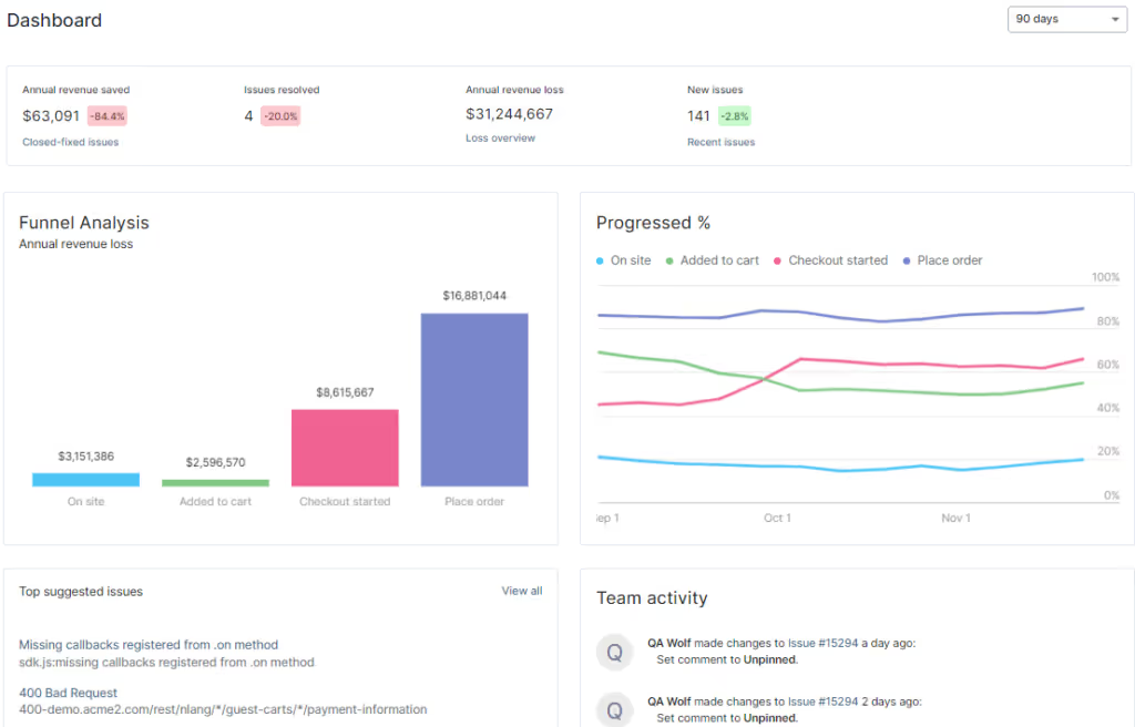
Noibu is an ecommerce analytics & monitoring platform purpose-built to help retailers protect and grow online revenue. By unifying site monitoring, experience analytics, and performance insights in a single console, Noibu helps ecommerce, engineering, and product teams understand what's happening across the shopping journey, prioritize what matters most, and act on the opportunities that drive growth — without dedicated analytics headcount.
Ready to see Noibu in action? [Book a demo today.]


