Analyze key website metrics. Discover all opportunities to convert. Grow revenue.
Trusted by the world’s biggest brands
How Noibu works
Noibu is an ecommerce analytics and monitoring platform. We enable teams to act quickly on the site issues, performance lags, and growth opportunities with the greatest revenue impact.

Detect and resolve errors faster.
Identify all technical issues on your site that are causing revenue loss with error monitoring and alerts.

.avif)
Find the needles in the haystack.
Step into your customers’ shoes with session replay to understand the true impact of each friction point.

.avif)
Fast site, faster sale. Every millisecond counts.
Improve site health with real user performance monitoring to pinpoint and eliminate slowdowns that impact conversion.
.avif)
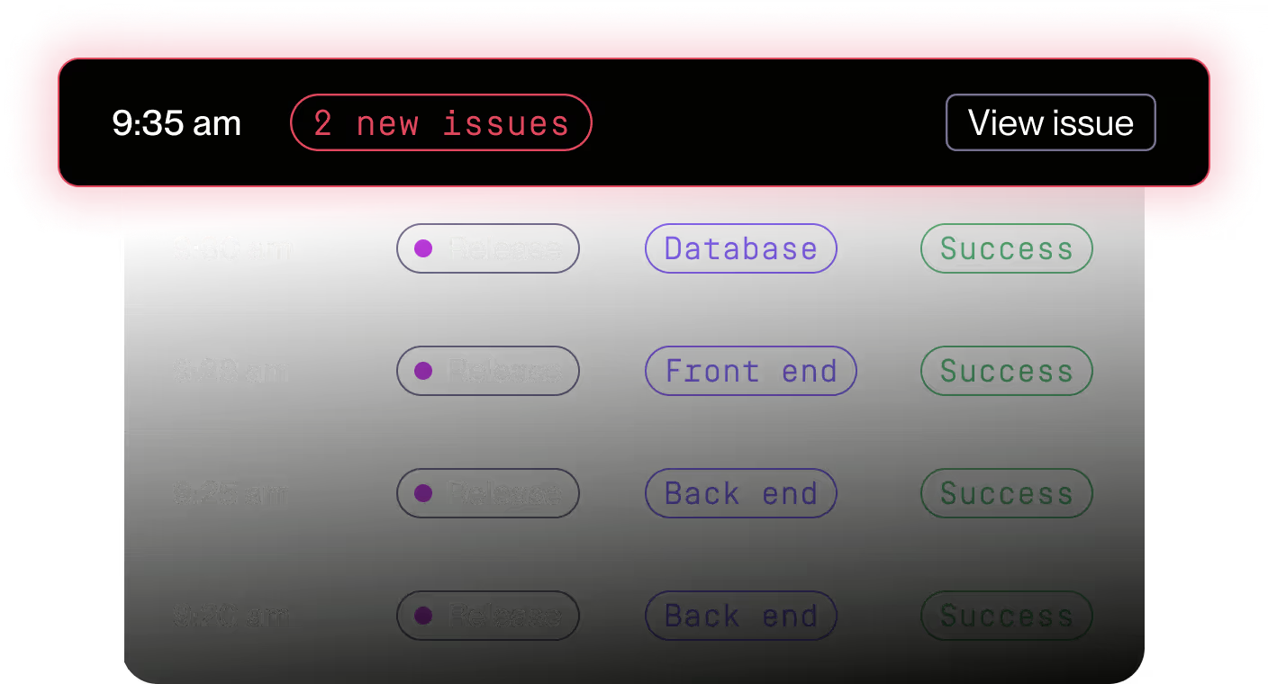
Know exactly what changed after every release.
Automatically track how every deployment affects errors, performance, and site health so you can validate impact quickly and ship with confidence.
.avif)
.avif)
Fast site, faster sale. Every millisecond counts.
Improve site health with real user performance monitoring to pinpoint and eliminate slowdowns that impact conversion.
.avif)
See what's costing you revenue and limiting growth.
Get a list of your top revenue-impacting errors
Uncover the most critical performance slowdowns
Gain clarity into real user behavior per page
Understand where to prioritize efforts and how to take action
Why teams choose Noibu
The smartest way to monitor your online store
Noibu's lightweight script monitors your online store around the clock, giving you real-time visibility into site issues, experience friction, and conversion growth opportunities.
Let Noibu's AI find what’s blocking your site’s growth
Unlock powerful insights with Noibu’s ecommerce intelligence to cut through complexity, find what you’re looking for, and take next steps with confidence.
That’s how we turn insight into action, and action into results.

Built to make ecommerce work
Learn how top retailers use Noibu to stay ahead in increasingly complex ecommerce environments

How Moschino uncovered and solved 100+ errors using Noibu
How Moschino uncovered and solved 100+ errors using Noibu

How Noibu helped Solo Stove boost annual ecommerce revenue by 15%
How Noibu Helped Solo Stove Boost Annual eCommerce Revenue by 15%

How Carrefour’s ongoing use of Noibu helps the team reach success
How Carrefour’s ongoing use of Noibu helps the team reach success
Integrates with the top ecommerce platforms you use
Noibu works seamlessly with leading ecommerce platforms, website builders, and custom sites.


Loved by ecommerce professionals, worldwide
.png)
Tim Haverman
“The detailed reporting and session replays have transformed our support operations. Our agents can now observe and communicate issues directly to developers, leading to quicker, more accurate resolutions.”
.png)
.png)
Chelsea Alverson
“We utilize HelpCode to skip the basics. Instead of asking what browser or URL a patient is using, all that context is available to our agents at the very start of the conversation.”
.png)

Michael Fulvio
“When a customer says the website is 'broken,' they usually can't provide technical details. Noibu points us directly to the issue so we don't have to spend hours going back and forth to find out what happened.”
.png)

Philip Krynsky
“No other tool aggregates heatmaps like Noibu. Most of our customers come in on product pages (PDPs) rather than the homepage. Being able to see the journey across those thousands of specific pages allowed us to surgically improve the experience and increase our average order value by 11%.”
.png)

Julian Charnas
“We’ve seen cases where users 'rage click' but still convert—which is not the experience we want. Being able to see that type of emotional behavior allows us to fix the friction and improve the journey for next time.”
.png)
.png)
Meredith Eads
“Noibu helps us identify UX issues by surfacing sessions based on user behavior. Instead of sifting through quantitative data, we can watch real users and see their pain points in real life.”
.png)

Philip Krynsky
“We used Noibu to shave seconds off our load time, which is a massive signal to search engines that we are relevant and fast. It allowed our developers to stop fighting backend fires and start spending more time on the frontend improvements that actually drive our PageRank and conversion.”
.png)
.png)
Tim Haverman
“Since integrating Noibu, the time we spend resolving errors has dropped drastically. What used to take 10 hours a week can now be addressed in just two, allowing our developers to be much more efficient.”
.png)
.png)
Rigel St. Pierre
“Before Noibu, it was a firehose of noise. Now, we have the ability to group issues and understand exactly where an issue is coming from. Having that level of technical detail is invaluable to our engineering team.”
.png)
.png)
Sébastien Ribeil
“In our product team, we work with OKRs and a data-driven strategy. Noibu allows us to apply that same rigor to error management, ensuring we only spend effort on the 5-10% of issues that drive real impact.”
.png)

Suntheng Taing
“Noibu gives me the clarity to prioritize. By uncovering exactly where checkout or cart friction is happening, we can decide which fixes go into a release based on how impactful they’ll actually be for our customers.”
.png)

Philip Krynsky
“Noibu gave us the confidence to move to Shopify. We could run tests in parallel, see what was running slow, and fix those issues before we ever went live. It turned a high-risk migration into a validated success."
.png)

John Merris
“If you’re doing any reasonable volume on an ecommerce site, having the ability to get recordings for checkout errors with Noibu is a no brainer.”


Carrie McMahon
"The biggest win for us has been saving critical development hours. We were spending a lot of time replicating issues and we have been able to cut down on that with Noibu."


Daniel Collier
“As you can imagine, it’s really hard to track down issues when you don’t know what browser the customer was using, which device they were on, what they had in their basket, or any of their other session details at all. It’s often really hard to replicate an issue that a random customer has, and Noibu has definitely helped in that aspect.”


Anique Ahmed
“From a PAT and UAT perspective, Noibu was something that was critical to the success of fixing ongoing issues that would arise.“


Jessie Kressen
“I see Noibu as a security initiative. I know that when we revise code, add new features, or make any big changes to our site, we have Noibu providing a regular health check. The platform helps keep everything more well-maintained and avoids the need for any security audits at our end."


Matthew Medlyn
"Replicability has been a huge win. Noibu takes the guesswork out of replicability by ensuring that our development agency doesn’t have to spend hours investigating issues.”


Nathan Armstrong
"I think about Noibu as a virtual 24/7 tech support agent that lives on all of our pages and is looking for issues and bubbling them to us proactively, allowing us to deliver the best customer experience. When customers are not having a delightful experience, it brings up those issues to us and tells us exactly what to do to solve them."


Kathryn Hutchison
“With Noibu, we are able to turn that customer conversation around to. ‘I’m so sorry that was an inconvenience to you. I believe you. I have everything I need to replicate the error and I’m going to share it with my developers.’ Noibu has helped bring about a really big change in how we receive and process customer complaints.”


Marcel Mundt
“Noibu is like an insurance policy [that] gives you peace of mind. It gives you the confidence to make new releases knowing that you’ve got something to make sure that things don’t go wrong.”


Eric Kelsey
“We're trying to be more consumer focused. And the fact that we can put a dollar value next to an issue allows us to have a business case to justify the work. It’s not just about what’s broken—it’s about what we can improve. Noibu helps us uncover what’s costing us money, even if no one’s reporting it.”


Corinne Julien
“Noibu's script helped us uncover the true nature of bugs on our site. It really opened our eyes to start being more proactive.”


Matthew Lawson
“The value for Ribble is at multiple levels: visibility, speed, accuracy, priority—all things combined, results in incredible value.”


Fiona Brown
“I’m sure every retailer is facing the same problem. It’s hard to make sure that we as a business are operating at 100% on every browser and device known to man.”


Jen Pearson
“The value of this tool is honestly impressive. It provides a lot more data and visibility than anything that we've had before, and I think it's actually going to dramatically increase conversion and improve our customers visits on the website so that they don't get annoyed and rage click and leave.”


Todd Purcell
“The alignment of errors to profit has been game-changing for me. Noibu’s ability to pinpoint the financial impact of errors is not something I’ve seen before. Because it’s so helpful to know which error we’re losing money on and whether it’s worthy of doing a hotfix.”


Martine Knight
“Being able to quantify errors resolved based on revenue saved is irreplaceable for me. I love being able to put a dollar amount to errors, so we actually know what level of priority it is.”


Joe Bona
“We’ve been using Noibu for two years, across five storefronts. It gives us a lot of visibility into what’s happening behind the scenes in areas that we would not catch. We’re able to fix issues quickly, with little downtime.”


Jared Poole
“Noibu is something I definitely would recommend to anybody who is having that frustration with identifying and trying to correlate these different points of information with identifying what the root cause of an issue is within your customers' user experience.”


Jennifer Rodriguez
“We brought Noibu in, and it has been a huge success. Not only has it helped detect bugs prior to customers calling in and telling us about them, but it has also really helped me and our engineers to smoothen out our processes.”

.png)
Tim Haverman
“The detailed reporting and session replays have transformed our support operations. Our agents can now observe and communicate issues directly to developers, leading to quicker, more accurate resolutions.”
.png)
.png)
Chelsea Alverson
“We utilize HelpCode to skip the basics. Instead of asking what browser or URL a patient is using, all that context is available to our agents at the very start of the conversation.”
.png)

Michael Fulvio
“When a customer says the website is 'broken,' they usually can't provide technical details. Noibu points us directly to the issue so we don't have to spend hours going back and forth to find out what happened.”
.png)

Philip Krynsky
“No other tool aggregates heatmaps like Noibu. Most of our customers come in on product pages (PDPs) rather than the homepage. Being able to see the journey across those thousands of specific pages allowed us to surgically improve the experience and increase our average order value by 11%.”
.png)

Julian Charnas
“We’ve seen cases where users 'rage click' but still convert—which is not the experience we want. Being able to see that type of emotional behavior allows us to fix the friction and improve the journey for next time.”
.png)
.png)
Meredith Eads
“Noibu helps us identify UX issues by surfacing sessions based on user behavior. Instead of sifting through quantitative data, we can watch real users and see their pain points in real life.”
.png)

Philip Krynsky
“We used Noibu to shave seconds off our load time, which is a massive signal to search engines that we are relevant and fast. It allowed our developers to stop fighting backend fires and start spending more time on the frontend improvements that actually drive our PageRank and conversion.”
.png)
.png)
Tim Haverman
“Since integrating Noibu, the time we spend resolving errors has dropped drastically. What used to take 10 hours a week can now be addressed in just two, allowing our developers to be much more efficient.”
.png)
.png)
Rigel St. Pierre
“Before Noibu, it was a firehose of noise. Now, we have the ability to group issues and understand exactly where an issue is coming from. Having that level of technical detail is invaluable to our engineering team.”
.png)
.png)
Sébastien Ribeil
“In our product team, we work with OKRs and a data-driven strategy. Noibu allows us to apply that same rigor to error management, ensuring we only spend effort on the 5-10% of issues that drive real impact.”
.png)

Suntheng Taing
“Noibu gives me the clarity to prioritize. By uncovering exactly where checkout or cart friction is happening, we can decide which fixes go into a release based on how impactful they’ll actually be for our customers.”
.png)

Philip Krynsky
“Noibu gave us the confidence to move to Shopify. We could run tests in parallel, see what was running slow, and fix those issues before we ever went live. It turned a high-risk migration into a validated success."
.png)

John Merris
“If you’re doing any reasonable volume on an ecommerce site, having the ability to get recordings for checkout errors with Noibu is a no brainer.”


Carrie McMahon
"The biggest win for us has been saving critical development hours. We were spending a lot of time replicating issues and we have been able to cut down on that with Noibu."


Daniel Collier
“As you can imagine, it’s really hard to track down issues when you don’t know what browser the customer was using, which device they were on, what they had in their basket, or any of their other session details at all. It’s often really hard to replicate an issue that a random customer has, and Noibu has definitely helped in that aspect.”


Anique Ahmed
“From a PAT and UAT perspective, Noibu was something that was critical to the success of fixing ongoing issues that would arise.“


Jessie Kressen
“I see Noibu as a security initiative. I know that when we revise code, add new features, or make any big changes to our site, we have Noibu providing a regular health check. The platform helps keep everything more well-maintained and avoids the need for any security audits at our end."


Matthew Medlyn
"Replicability has been a huge win. Noibu takes the guesswork out of replicability by ensuring that our development agency doesn’t have to spend hours investigating issues.”


Nathan Armstrong
"I think about Noibu as a virtual 24/7 tech support agent that lives on all of our pages and is looking for issues and bubbling them to us proactively, allowing us to deliver the best customer experience. When customers are not having a delightful experience, it brings up those issues to us and tells us exactly what to do to solve them."


Kathryn Hutchison
“With Noibu, we are able to turn that customer conversation around to. ‘I’m so sorry that was an inconvenience to you. I believe you. I have everything I need to replicate the error and I’m going to share it with my developers.’ Noibu has helped bring about a really big change in how we receive and process customer complaints.”


Marcel Mundt
“Noibu is like an insurance policy [that] gives you peace of mind. It gives you the confidence to make new releases knowing that you’ve got something to make sure that things don’t go wrong.”


Eric Kelsey
“We're trying to be more consumer focused. And the fact that we can put a dollar value next to an issue allows us to have a business case to justify the work. It’s not just about what’s broken—it’s about what we can improve. Noibu helps us uncover what’s costing us money, even if no one’s reporting it.”


Corinne Julien
“Noibu's script helped us uncover the true nature of bugs on our site. It really opened our eyes to start being more proactive.”


Matthew Lawson
“The value for Ribble is at multiple levels: visibility, speed, accuracy, priority—all things combined, results in incredible value.”


Fiona Brown
“I’m sure every retailer is facing the same problem. It’s hard to make sure that we as a business are operating at 100% on every browser and device known to man.”


Jen Pearson
“The value of this tool is honestly impressive. It provides a lot more data and visibility than anything that we've had before, and I think it's actually going to dramatically increase conversion and improve our customers visits on the website so that they don't get annoyed and rage click and leave.”


Todd Purcell
“The alignment of errors to profit has been game-changing for me. Noibu’s ability to pinpoint the financial impact of errors is not something I’ve seen before. Because it’s so helpful to know which error we’re losing money on and whether it’s worthy of doing a hotfix.”


Martine Knight
“Being able to quantify errors resolved based on revenue saved is irreplaceable for me. I love being able to put a dollar amount to errors, so we actually know what level of priority it is.”


Joe Bona
“We’ve been using Noibu for two years, across five storefronts. It gives us a lot of visibility into what’s happening behind the scenes in areas that we would not catch. We’re able to fix issues quickly, with little downtime.”


Jared Poole
“Noibu is something I definitely would recommend to anybody who is having that frustration with identifying and trying to correlate these different points of information with identifying what the root cause of an issue is within your customers' user experience.”


Jennifer Rodriguez
“We brought Noibu in, and it has been a huge success. Not only has it helped detect bugs prior to customers calling in and telling us about them, but it has also really helped me and our engineers to smoothen out our processes.”

.png)
Tim Haverman
“The detailed reporting and session replays have transformed our support operations. Our agents can now observe and communicate issues directly to developers, leading to quicker, more accurate resolutions.”
.png)
.png)
Chelsea Alverson
“We utilize HelpCode to skip the basics. Instead of asking what browser or URL a patient is using, all that context is available to our agents at the very start of the conversation.”
.png)

Michael Fulvio
“When a customer says the website is 'broken,' they usually can't provide technical details. Noibu points us directly to the issue so we don't have to spend hours going back and forth to find out what happened.”
.png)

Philip Krynsky
“No other tool aggregates heatmaps like Noibu. Most of our customers come in on product pages (PDPs) rather than the homepage. Being able to see the journey across those thousands of specific pages allowed us to surgically improve the experience and increase our average order value by 11%.”
.png)

Julian Charnas
“We’ve seen cases where users 'rage click' but still convert—which is not the experience we want. Being able to see that type of emotional behavior allows us to fix the friction and improve the journey for next time.”
.png)
.png)
Meredith Eads
“Noibu helps us identify UX issues by surfacing sessions based on user behavior. Instead of sifting through quantitative data, we can watch real users and see their pain points in real life.”
.png)

Philip Krynsky
“We used Noibu to shave seconds off our load time, which is a massive signal to search engines that we are relevant and fast. It allowed our developers to stop fighting backend fires and start spending more time on the frontend improvements that actually drive our PageRank and conversion.”
.png)
.png)
Tim Haverman
“Since integrating Noibu, the time we spend resolving errors has dropped drastically. What used to take 10 hours a week can now be addressed in just two, allowing our developers to be much more efficient.”
.png)
.png)
Rigel St. Pierre
“Before Noibu, it was a firehose of noise. Now, we have the ability to group issues and understand exactly where an issue is coming from. Having that level of technical detail is invaluable to our engineering team.”
.png)
.png)
Sébastien Ribeil
“In our product team, we work with OKRs and a data-driven strategy. Noibu allows us to apply that same rigor to error management, ensuring we only spend effort on the 5-10% of issues that drive real impact.”
.png)

Suntheng Taing
“Noibu gives me the clarity to prioritize. By uncovering exactly where checkout or cart friction is happening, we can decide which fixes go into a release based on how impactful they’ll actually be for our customers.”
.png)

Philip Krynsky
“Noibu gave us the confidence to move to Shopify. We could run tests in parallel, see what was running slow, and fix those issues before we ever went live. It turned a high-risk migration into a validated success."
.png)

John Merris
“If you’re doing any reasonable volume on an ecommerce site, having the ability to get recordings for checkout errors with Noibu is a no brainer.”


Carrie McMahon
"The biggest win for us has been saving critical development hours. We were spending a lot of time replicating issues and we have been able to cut down on that with Noibu."


Daniel Collier
“As you can imagine, it’s really hard to track down issues when you don’t know what browser the customer was using, which device they were on, what they had in their basket, or any of their other session details at all. It’s often really hard to replicate an issue that a random customer has, and Noibu has definitely helped in that aspect.”


Anique Ahmed
“From a PAT and UAT perspective, Noibu was something that was critical to the success of fixing ongoing issues that would arise.“


Jessie Kressen
“I see Noibu as a security initiative. I know that when we revise code, add new features, or make any big changes to our site, we have Noibu providing a regular health check. The platform helps keep everything more well-maintained and avoids the need for any security audits at our end."


Matthew Medlyn
"Replicability has been a huge win. Noibu takes the guesswork out of replicability by ensuring that our development agency doesn’t have to spend hours investigating issues.”


Nathan Armstrong
"I think about Noibu as a virtual 24/7 tech support agent that lives on all of our pages and is looking for issues and bubbling them to us proactively, allowing us to deliver the best customer experience. When customers are not having a delightful experience, it brings up those issues to us and tells us exactly what to do to solve them."


Kathryn Hutchison
“With Noibu, we are able to turn that customer conversation around to. ‘I’m so sorry that was an inconvenience to you. I believe you. I have everything I need to replicate the error and I’m going to share it with my developers.’ Noibu has helped bring about a really big change in how we receive and process customer complaints.”


Marcel Mundt
“Noibu is like an insurance policy [that] gives you peace of mind. It gives you the confidence to make new releases knowing that you’ve got something to make sure that things don’t go wrong.”


Eric Kelsey
“We're trying to be more consumer focused. And the fact that we can put a dollar value next to an issue allows us to have a business case to justify the work. It’s not just about what’s broken—it’s about what we can improve. Noibu helps us uncover what’s costing us money, even if no one’s reporting it.”


Corinne Julien
“Noibu's script helped us uncover the true nature of bugs on our site. It really opened our eyes to start being more proactive.”


Matthew Lawson
“The value for Ribble is at multiple levels: visibility, speed, accuracy, priority—all things combined, results in incredible value.”


Fiona Brown
“I’m sure every retailer is facing the same problem. It’s hard to make sure that we as a business are operating at 100% on every browser and device known to man.”


Jen Pearson
“The value of this tool is honestly impressive. It provides a lot more data and visibility than anything that we've had before, and I think it's actually going to dramatically increase conversion and improve our customers visits on the website so that they don't get annoyed and rage click and leave.”


Todd Purcell
“The alignment of errors to profit has been game-changing for me. Noibu’s ability to pinpoint the financial impact of errors is not something I’ve seen before. Because it’s so helpful to know which error we’re losing money on and whether it’s worthy of doing a hotfix.”


Martine Knight
“Being able to quantify errors resolved based on revenue saved is irreplaceable for me. I love being able to put a dollar amount to errors, so we actually know what level of priority it is.”


Joe Bona
“We’ve been using Noibu for two years, across five storefronts. It gives us a lot of visibility into what’s happening behind the scenes in areas that we would not catch. We’re able to fix issues quickly, with little downtime.”


Jared Poole
“Noibu is something I definitely would recommend to anybody who is having that frustration with identifying and trying to correlate these different points of information with identifying what the root cause of an issue is within your customers' user experience.”


Jennifer Rodriguez
“We brought Noibu in, and it has been a huge success. Not only has it helped detect bugs prior to customers calling in and telling us about them, but it has also really helped me and our engineers to smoothen out our processes.”

.png)
Tim Haverman
“The detailed reporting and session replays have transformed our support operations. Our agents can now observe and communicate issues directly to developers, leading to quicker, more accurate resolutions.”
.png)
.png)
Chelsea Alverson
“We utilize HelpCode to skip the basics. Instead of asking what browser or URL a patient is using, all that context is available to our agents at the very start of the conversation.”
.png)

Michael Fulvio
“When a customer says the website is 'broken,' they usually can't provide technical details. Noibu points us directly to the issue so we don't have to spend hours going back and forth to find out what happened.”
.png)

Philip Krynsky
“No other tool aggregates heatmaps like Noibu. Most of our customers come in on product pages (PDPs) rather than the homepage. Being able to see the journey across those thousands of specific pages allowed us to surgically improve the experience and increase our average order value by 11%.”
.png)

Julian Charnas
“We’ve seen cases where users 'rage click' but still convert—which is not the experience we want. Being able to see that type of emotional behavior allows us to fix the friction and improve the journey for next time.”
.png)
.png)
Meredith Eads
“Noibu helps us identify UX issues by surfacing sessions based on user behavior. Instead of sifting through quantitative data, we can watch real users and see their pain points in real life.”
.png)

Philip Krynsky
“We used Noibu to shave seconds off our load time, which is a massive signal to search engines that we are relevant and fast. It allowed our developers to stop fighting backend fires and start spending more time on the frontend improvements that actually drive our PageRank and conversion.”
.png)
.png)
Tim Haverman
“Since integrating Noibu, the time we spend resolving errors has dropped drastically. What used to take 10 hours a week can now be addressed in just two, allowing our developers to be much more efficient.”
.png)
.png)
Rigel St. Pierre
“Before Noibu, it was a firehose of noise. Now, we have the ability to group issues and understand exactly where an issue is coming from. Having that level of technical detail is invaluable to our engineering team.”
.png)
.png)
Sébastien Ribeil
“In our product team, we work with OKRs and a data-driven strategy. Noibu allows us to apply that same rigor to error management, ensuring we only spend effort on the 5-10% of issues that drive real impact.”
.png)

Suntheng Taing
“Noibu gives me the clarity to prioritize. By uncovering exactly where checkout or cart friction is happening, we can decide which fixes go into a release based on how impactful they’ll actually be for our customers.”
.png)

Philip Krynsky
“Noibu gave us the confidence to move to Shopify. We could run tests in parallel, see what was running slow, and fix those issues before we ever went live. It turned a high-risk migration into a validated success."
.png)

John Merris
“If you’re doing any reasonable volume on an ecommerce site, having the ability to get recordings for checkout errors with Noibu is a no brainer.”


Carrie McMahon
"The biggest win for us has been saving critical development hours. We were spending a lot of time replicating issues and we have been able to cut down on that with Noibu."


Daniel Collier
“As you can imagine, it’s really hard to track down issues when you don’t know what browser the customer was using, which device they were on, what they had in their basket, or any of their other session details at all. It’s often really hard to replicate an issue that a random customer has, and Noibu has definitely helped in that aspect.”


Anique Ahmed
“From a PAT and UAT perspective, Noibu was something that was critical to the success of fixing ongoing issues that would arise.“


Jessie Kressen
“I see Noibu as a security initiative. I know that when we revise code, add new features, or make any big changes to our site, we have Noibu providing a regular health check. The platform helps keep everything more well-maintained and avoids the need for any security audits at our end."


Matthew Medlyn
"Replicability has been a huge win. Noibu takes the guesswork out of replicability by ensuring that our development agency doesn’t have to spend hours investigating issues.”


Nathan Armstrong
"I think about Noibu as a virtual 24/7 tech support agent that lives on all of our pages and is looking for issues and bubbling them to us proactively, allowing us to deliver the best customer experience. When customers are not having a delightful experience, it brings up those issues to us and tells us exactly what to do to solve them."


Kathryn Hutchison
“With Noibu, we are able to turn that customer conversation around to. ‘I’m so sorry that was an inconvenience to you. I believe you. I have everything I need to replicate the error and I’m going to share it with my developers.’ Noibu has helped bring about a really big change in how we receive and process customer complaints.”


Marcel Mundt
“Noibu is like an insurance policy [that] gives you peace of mind. It gives you the confidence to make new releases knowing that you’ve got something to make sure that things don’t go wrong.”


Eric Kelsey
“We're trying to be more consumer focused. And the fact that we can put a dollar value next to an issue allows us to have a business case to justify the work. It’s not just about what’s broken—it’s about what we can improve. Noibu helps us uncover what’s costing us money, even if no one’s reporting it.”


Corinne Julien
“Noibu's script helped us uncover the true nature of bugs on our site. It really opened our eyes to start being more proactive.”


Matthew Lawson
“The value for Ribble is at multiple levels: visibility, speed, accuracy, priority—all things combined, results in incredible value.”


Fiona Brown
“I’m sure every retailer is facing the same problem. It’s hard to make sure that we as a business are operating at 100% on every browser and device known to man.”


Jen Pearson
“The value of this tool is honestly impressive. It provides a lot more data and visibility than anything that we've had before, and I think it's actually going to dramatically increase conversion and improve our customers visits on the website so that they don't get annoyed and rage click and leave.”


Todd Purcell
“The alignment of errors to profit has been game-changing for me. Noibu’s ability to pinpoint the financial impact of errors is not something I’ve seen before. Because it’s so helpful to know which error we’re losing money on and whether it’s worthy of doing a hotfix.”


Martine Knight
“Being able to quantify errors resolved based on revenue saved is irreplaceable for me. I love being able to put a dollar amount to errors, so we actually know what level of priority it is.”


Joe Bona
“We’ve been using Noibu for two years, across five storefronts. It gives us a lot of visibility into what’s happening behind the scenes in areas that we would not catch. We’re able to fix issues quickly, with little downtime.”


Jared Poole
“Noibu is something I definitely would recommend to anybody who is having that frustration with identifying and trying to correlate these different points of information with identifying what the root cause of an issue is within your customers' user experience.”


Jennifer Rodriguez
“We brought Noibu in, and it has been a huge success. Not only has it helped detect bugs prior to customers calling in and telling us about them, but it has also really helped me and our engineers to smoothen out our processes.”

Uncover hidden revenue loss and your biggest growth opportunities.
Every day without visibility is revenue at risk. Start protecting revenue and unlocking growth opportunities today with Noibu.


.avif)
.avif)


.avif)
.avif)
.avif)
